泰坦尼克事故生还率和各因素之间数据分析
UCI Titanic dataset 是一个数据分析学习中常见的数据集,记录了泰坦尼克号事故中所有乘客信息。常被用做数据分析入门,相当于数据分析的hello world。
正好学了一下用GitHub Page 搭建博客,便试着把分析的过程放到博客上记录一下,主要是熟悉一下pandas和matplotlib的使用。
1.导入数据
#需要用到的一些库
import numpy as np
import pandas as pd
import matplotlib.pyplot as plt
import seaborn as sb
%matplotlib inline
#导入数据
data = pd.read_csv('Titanic.csv')
data.head()
| PassengerId | Survived | Pclass | Name | Sex | Age | SibSp | Parch | Ticket | Fare | Cabin | Embarked | |
|---|---|---|---|---|---|---|---|---|---|---|---|---|
| 0 | 1 | 0 | 3 | Braund, Mr. Owen Harris | male | 22.0 | 1 | 0 | A/5 21171 | 7.2500 | NaN | S |
| 1 | 2 | 1 | 1 | Cumings, Mrs. John Bradley (Florence Briggs Th... | female | 38.0 | 1 | 0 | PC 17599 | 71.2833 | C85 | C |
| 2 | 3 | 1 | 3 | Heikkinen, Miss. Laina | female | 26.0 | 0 | 0 | STON/O2. 3101282 | 7.9250 | NaN | S |
| 3 | 4 | 1 | 1 | Futrelle, Mrs. Jacques Heath (Lily May Peel) | female | 35.0 | 1 | 0 | 113803 | 53.1000 | C123 | S |
| 4 | 5 | 0 | 3 | Allen, Mr. William Henry | male | 35.0 | 0 | 0 | 373450 | 8.0500 | NaN | S |
表头描述
| 变量 | PassengerId | Survived | Pclass | Name | Sex | Age | SibSp | Parch | Ticket | Fare | Cabin | Embarked |
|---|---|---|---|---|---|---|---|---|---|---|---|---|
| 变量解释 | 乘客编号 | 乘客是否存活(0=NO 1=Yes) | 乘客所在的船舱等级,(1=1st,2=2nd,3=3rd) | 乘客姓名 | 乘客性别 | 乘客年龄 | 乘客的兄弟姐妹和配偶数量 | 乘客的父母与子女数量 | 票的编号 | 票价 | 座位号 | 乘客登船码头。 C = Cherbourg Q = Queenstown S = Southampton |
data.info()
<class 'pandas.core.frame.DataFrame'>
RangeIndex: 891 entries, 0 to 890
Data columns (total 12 columns):
PassengerId    891 non-null int64
Survived       891 non-null int64
Pclass         891 non-null int64
Name           891 non-null object
Sex            891 non-null object
Age            714 non-null float64
SibSp          891 non-null int64
Parch          891 non-null int64
Ticket         891 non-null object
Fare           891 non-null float64
Cabin          204 non-null object
Embarked       889 non-null object
dtypes: float64(2), int64(5), object(5)
memory usage: 83.6+ KB
共有891条数据,其中Age字段有部分缺失,Cabin字段大量缺失。
舍去座位号Cabin,不对其进行分析(对分析应该也没什么用,已经有仓等pclass这个字段了)
舍去船票编号Ticket,常识和直觉都告诉我这个变量对分析没用
#去掉Cabin, Ticket字段
data = data.drop(['Cabin','Ticket'],axis=1)
data.describe()
| PassengerId | Survived | Pclass | Age | SibSp | Parch | Fare | |
|---|---|---|---|---|---|---|---|
| count | 891.000000 | 891.000000 | 891.000000 | 714.000000 | 891.000000 | 891.000000 | 891.000000 |
| mean | 446.000000 | 0.383838 | 2.308642 | 29.699118 | 0.523008 | 0.381594 | 32.204208 |
| std | 257.353842 | 0.486592 | 0.836071 | 14.526497 | 1.102743 | 0.806057 | 49.693429 |
| min | 1.000000 | 0.000000 | 1.000000 | 0.420000 | 0.000000 | 0.000000 | 0.000000 |
| 25% | 223.500000 | 0.000000 | 2.000000 | 20.125000 | 0.000000 | 0.000000 | 7.910400 |
| 50% | 446.000000 | 0.000000 | 3.000000 | 28.000000 | 0.000000 | 0.000000 | 14.454200 |
| 75% | 668.500000 | 1.000000 | 3.000000 | 38.000000 | 1.000000 | 0.000000 | 31.000000 |
| max | 891.000000 | 1.000000 | 3.000000 | 80.000000 | 8.000000 | 6.000000 | 512.329200 |
2.分析数据
接下来逐个对变量进行分析
2.1 年龄
年龄有约1/4的值缺失,先看看值是否缺失和生还率有没有什么关系
这里用卡方检验来看年龄是否缺失和是否生还的关系
直觉告诉我肯定没关系
is_survivor = pd.DataFrame([data['Survived'][data['Age'].notnull()].value_counts() , data['Survived'][data['Age'].isnull()].value_counts()] ,
                           index = ['notnull','null'] )
is_survivor
| 0 | 1 | |
|---|---|---|
| notnull | 424 | 290 |
| null | 125 | 52 |
#卡方检验,检查相关性
from scipy.stats import chi2_contingency
chi2_contingency(is_survivor)
(7.10597508442256,
 0.007682742096212262,
 1,
 array([[439.93939394, 274.06060606],
        [109.06060606,  67.93939394]]))
得到结果: \(χ^{2}=7.1\) \(p=0.007\)
所以生还和年龄缺失有关系的可能性仅为0.007,认为它们不相关
所以我们在接下来对年龄的分析中,把缺失值剔除
#年龄频率直方图

fig, (ax) = plt.subplots( figsize=(6, 4))

plot = ax.hist([
               data['Age'][data['Survived']==1][data['Age'].notnull()],
               data['Age'][data['Survived']==0][data['Age'].notnull()]
              ],
        8,
         normed=1,
         histtype='bar',
         stacked=True)
ax.set_title('Age-Frequency Histogram',fontsize=20)
ax.set_xlabel('Age',fontsize=15)
ax.set_ylabel('Frequency',fontsize=15)

legend = plt.legend(plot,labels=['Survived','Not survived'],loc='upper right',fontsize=12)

fig.tight_layout()
plt.show()
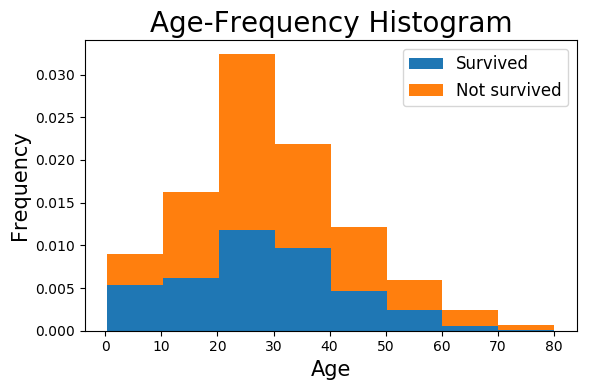
上面是根据数据画出来年龄频率直方图,蓝色和橙色面积分别代表获救和遇难人数
从图中隐约可以看出,年龄越小获救概率越大
为了验证这个猜想,对年龄和是否获救进行卡方检验
age_range = [i for i in range(0,80,10)]
i = 0
chi_sq = pd.DataFrame(
    [  [data[data['Age'] > i][data['Age'] <= i+10][data['Survived']==1]['Age'].count(),
       data[data['Age'] > i][data['Age'] <= i+10][data['Survived']==0]['Age'].count()]  for i in age_range ],
    columns = ['Survived', 'Not survived'],
    index = [ '{0}岁~{1}岁'.format(i,i+10)  for i in age_range ]
)
chi_sq
C:\Program Files\Anaconda3\lib\site-packages\ipykernel\__main__.py:5: UserWarning: Boolean Series key will be reindexed to match DataFrame index.
| Survived | Not survived | |
|---|---|---|
| 0岁~10岁 | 38 | 26 |
| 10岁~20岁 | 44 | 71 |
| 20岁~30岁 | 84 | 146 |
| 30岁~40岁 | 69 | 86 |
| 40岁~50岁 | 33 | 53 |
| 50岁~60岁 | 17 | 25 |
| 60岁~70岁 | 4 | 13 |
| 70岁~80岁 | 1 | 4 |
#各年龄段乘客的生存率
chi_sq['Survived']/(chi_sq['Survived'] + chi_sq['Not survived'])
0岁~10岁     0.593750
10岁~20岁    0.382609
20岁~30岁    0.365217
30岁~40岁    0.445161
40岁~50岁    0.383721
50岁~60岁    0.404762
60岁~70岁    0.235294
70岁~80岁    0.200000
dtype: float64
从各年龄生存率可以看出:
- 10岁以下儿童的生存率明显高于其他人
- 60岁以上老人生存率明显低于其他人
#卡方检验
chi2_contingency(chi_sq)
(15.296687749545693,
 0.03237887956708356,
 7,
 array([[ 25.99439776,  38.00560224],
        [ 46.70868347,  68.29131653],
        [ 93.41736695, 136.58263305],
        [ 62.95518207,  92.04481793],
        [ 34.92997199,  51.07002801],
        [ 17.05882353,  24.94117647],
        [  6.9047619 ,  10.0952381 ],
        [  2.03081232,   2.96918768]]))
\(χ^{2}=15.29\) \(p=0.03\) 可以认为不相关
2.2 仓等
pclass = pd.DataFrame([data[data['Survived'] == 1].groupby(['Pclass']).count()['Name'],data[data['Survived'] == 0].groupby(['Pclass']).count()['Name']],
                         index = ['Survived','Not survived'])
fig, (ax) = plt.subplots( figsize=(6, 4))

ax.bar([0,1,2], pclass.loc['Survived'], label='Survived',fc = '#1F77B4')
ax.bar([0,1,2], pclass.loc['Not survived'], bottom=pclass.loc['Survived'], label='Not survived',tick_label = [1,2,3], fc = '#FF7F0E')
ax.legend()
ax.set_title('Number of Survivor in Different Classes')
ax.set_xlabel('Class')
ax.set_ylabel('Num')
plt.show()
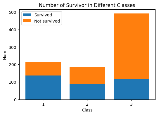
直接从图可以看出头等舱生还率最大,其次二等舱,再次三等舱。
未完待续
- 接下来会对性别、兄弟姐妹数量、父母子女数量、登船码头进行分析
- 分析完后将分析多因素对生还率的影响